I love my Netflix. I have cable, Verizon FIOS, but I can’t remember the last time I turned on the box to actually watch something. There’s never anything on and the commercials are ridiculous so most everything I watch is through Netflix. I have Amazon Prime too and I watch a few things on there that I can’t get on Netflix but I’ve got a feeling I’ll be watching it more.
I’ve been a Netflix subscriber for many years and I’ve dealt with the price increases, it’s worth it to me as I more than get my money’s worth from it.
I also dealt with the last interface update and didn’t like that one either but I got accustomed to it as they did revert my list back to the way it was originally and I could go to a page and there was everything. The last interface wasn’t that bad, at least you could go to a page for the movie or show, but now you can’t do that it seems.
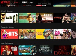
This new interface is horrible, it’s dark and you can’t go to a shows page anymore.
I’ve been catching up on SHIELD and there is no page for it anymore with the episode listings. You have to actually click on it, it starts playing, you have to hit the X button up in the corner and then you’ll see sort of a list of episodes which you have to scroll through. What the hell was wrong with the old way as just having the list of episodes there for you? (oh wait I just noticed an arrow there at the bottom when you hover that opens the overview and episode listings, not exactly intuitive is it?)
What’s with all the clicking I have to do now? Before I could go to a page and there it was. Just hover over and click ‘more info’ and I was taken to the shows page with everything right there for you. Now I have to hover, click the arrow, click the episodes, click the ‘more like this’, click the details, and of course I have to click the arrows to scroll through the episodes. Who thought it was a good idea with all the clicking now? What was wrong with having everything on the same page for you to EASILY read with basically one click?! Reviews are now overlaid on the screen so more clicking there yet again. Going through it, it’s hover, click (to open/expand), click (episodes), click,click (to scroll through episodes, with more clicks for more episodes as it only shows 5 at a time ), click (to start episode), click (more like this), click (details), click (reviews), click (to close reviews), click (to close expanded view). It’s basically 10 clicks to watch a show?! Even more clicks if you want to find a certain episode to watch as the screen only shows 5 eps at a time. Who though that was good idea?
And what happened to clicking the section title on the homepage? I used to be able to click something like ‘New Releases’ or ‘Watch it Again’ and it would take me to that page so I can see them and sort them as well. Now I can only scroll through them left or right on the main page. Some of them you can click, but the ones I want to be able to click I can’t.
Who thought this new interface was a good idea?
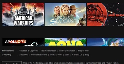
Also the interface is broken:
Where’s the rest of the screen? And no I can’t scroll anymore. That’s the sci-fi section that I sorted A-Z, so where’ the rest? It’s just cut-off, I thought there was supposed to more?!
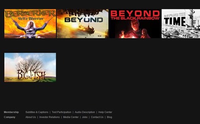
I refreshed the page and got this:
A little more but that’s it?! It just stops at ‘Big Fish’! Where’s the rest of the movies? Where are my movies?
I do most of my watching on my PC and it’s not exactly a mouse friendly site. It might be easier to use on a tablet, but on desktop, no it isn’t.
Also, why is it so dark? Nighttime mode I guess right?
As I said I’ve been a Netflix customer for many years and through everything I’ve dealt with it, never really thought about seriously cancelling my membership until now. This new design is just horrible and it makes the user do more work than they should have to.


2 comments for “Netflix New Interface Redesign is Horribly Not User Friendly”